Interior · Palette
Colour from the Canvas
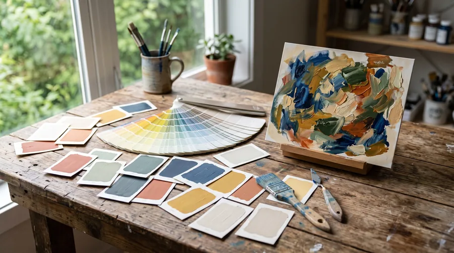
The wall colour of a room that lives with art is not chosen from a chart. It is lifted from the work: the quiet tone in the background of the painting, taken to the walls at a lower saturation, and the loud tone left to the painting.

There is a way of decorating in which the sofa is bought first, then the rug, then a painting is found to match. It produces rooms that photograph well and feel like nothing. The other way starts with the work. A painting, a photograph, a textile that was bought because it stopped you, and a room built outwards from it, colour by colour. It is easier than it sounds, because the painter has already done the hard part.
The painting has a palette
Every finished work has a small number of colours doing most of the work, usually five or six, and among them a hierarchy: a ground or dominant tone, one or two secondary tones, and an accent that appears in small quantities and carries the picture. A gallerist sees this in a second. Anyone can learn to, and the Atelier's palette tool does it mechanically, reading a photograph of the work and returning its five most present colours in order of area.
Which colour goes on the wall
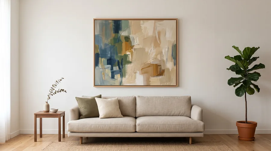
Not the accent. The accent is the painting's, and a room painted in it competes with the work and loses. The wall takes the ground: the quietest large tone in the picture, and takes it at a lower saturation and often a lighter value than it appears in the paint. If the painting has a field of warm ochre, the wall is a pale, greyed ochre, a stone colour, so that the painting looks like the concentrated version of the room. The eye reads the relationship and the room becomes an extension of the work.
Paint the room the colour the painting would be if you left it in the rain for a year.
A colourist who advises galleries on their walls
The secondary tones
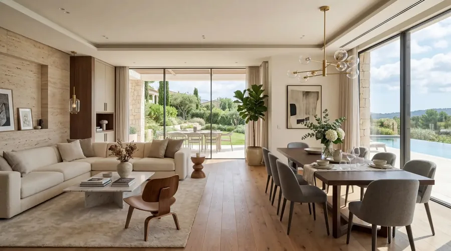
Textiles take the secondaries: the sofa, the curtains, the rug, in the second and third colours of the painting, again dropped in saturation. Wood and stone are colours too and count in the palette; an oak floor is a warm yellow, a concrete one a cool grey, and the work should agree with them or be hung elsewhere. The accent, finally, is allowed exactly one appearance outside the painting: a cushion, a lamp, a bowl. More than one and the room has been themed.
White is a colour
Gallery white is not neutral. A cold, blue-white wall makes warm paintings look muddy and cool ones look thin; a warm, slightly yellow white flatters most works and is what the better galleries actually use, under a name that does not sound like white. If the room is to be white, choose the white the way you would choose any colour: from the painting, against a large sample, at night as well as by day.
Dark walls
A dark wall, deep green or brown or near black, does what a black box gallery does: it makes a gilt frame glow, a pale work advance and a dense work sink into it. It suits rooms used after dark, small rooms that cannot pretend to be large, and collections of works on paper in pale mats. It does not suit a large canvas in strong colour, which needs the wall to step back. The Show on this site lets you switch the wall under each work; the pale works survive the black wall and the dark ones do not.
Why it works
A room built from a painting has a reason for every colour in it, and reasons are what the eye recognises as calm. Nobody entering the room will name the method. They will say that the painting looks as if it belongs there, which is the highest compliment a room can be paid and the only one the painting will accept.